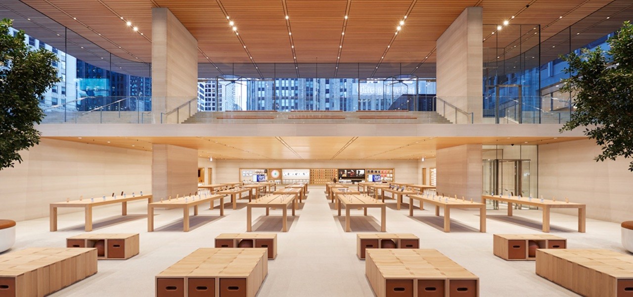
‘Everything is well thought out’: How the Apple store has become a template for retailers

At a distance, McDonald’s 19,000 square-foot flagship location in Chicago could be mistaken for an Apple store. Its boxy, glass-paneled design, and its airy, minimalistic look and feel, combined with modern-looking furniture, offer some clues as to what might have inspired the design. The company is calling it an “Experience of the Future” store, a format that inspired 4,500 store renovations last year, and it plans to grow the concept.
Other retailers are drawing inspiration from Apple’s store model. Apple has built a retail template other stores can borrow from: neat minimal stores with personalized service and experiences, including events and classes. It’s become the default setting for store design makeovers. In November 2010, Tesla hired Apple’s former vp of real estate George Blankenship, who worked at Microsoft for a year prior (he left Tesla in 2013).
“When the Tesla showroom first opened, I interviewed the head of retail for Tesla, a former Apple retail guy,” said Carmine Gallo, an author who has been studying Apple’s retail model for more than a decade. “I said, ‘This does remind me of an Apple store.’ He leaned over and said, ‘This is an Apple Store — we just sell cars.'”
It’s not only Silicon Valley brands borrowing from Apple. The list of retailers adding elements of Apple’s model keeps expanding and now includes brands like Samsung, AT&T and Verizon, as well as big-box retailers like Kohl’s and Walmart, which rolled out Apple-style associate-assisted checkout around last year’s holiday season. Digital-first beauty brand Glossier, which has stores in New York, Los Angeles and Miami, models its stores as experiential product showrooms, with products neatly laid out in uncluttered open spaces designed for discovery, with careful consideration to lighting and presentation.
“We think a lot about Apple as we think about our design and experience,” founder and CEO Emily Weiss said in a recent interview.
Apple’s 506 stores have been lauded as a retail success story, yielding approximately $5,546 per square foot, according to a 2017 CoStar study. For retailers squeezed by Amazon, the growth of online commerce and outdated stores that face declining traffic, appropriating elements of Apple’s model is a way to breathe life back into physical stores. A clean, carefully presented selection of products, a help center that resembles a hotel concierge, a space for events and classes, and a cashierless checkout system are some elements retailers are trying to copy. The common denominator is that they’re all aiming to nail an approach to retail that’s predicated on a glitch-free, easy customer experience.
“Everything is well thought out,” said Gallo. “What does a store that enriches lives look like? It’s going to be clean, uncluttered and appealing. They’re going to welcome you within a few feet or a few seconds of entering the store.”
Ad position: web_incontent_pos1
Though the departure of Apple’s svp of retail Angela Ahrendts in February drew concerns the model was looking tired, one industry source who has worked with Apple noted that it’s more a sign that the Apple store template is on firm footing, a formula that can be exported easily to other contexts.
“[Ahrendts] basically provided a framework already,” the source said. “The stores aren’t designed to be distributed model for revenue — they don’t need the stores. There’s a deeper manifestation of the educational mission [now]. It’s not just a place to tell you how to fix or use your phone.”
With more retailers looking to its model for inspiration, Apple has started to consider what the next move is to improve upon its stores. It launched a “next generation” store model in 2016, which builds on its initial proposition, and it’s in the process of updating more store locations. The renovated stores feature interactive windows showcasing products, an expanded Genius Bar (“The Genius Grove”) with trees, an event space next to a video wall, public space with free wifi and boardrooms for training sessions.
But despite moves to incorporate elements of Apple’s model in a traditional retail context, other industry observers say traditional retailers have failed to do so beyond some of the aesthetic elements, and Apple Store retail elements aren’t necessarily applicable to all traditional, big-box retail situations.
“A lot of people think that the success is because of the look,” said retail store designer Sergio Mannino, owner of a New York-based creative design firm. “It’s successful for Apple but not translatable, because that store is the perfect representation of what the brand stands for.”
Ad position: web_incontent_pos2
What many retailers miss, he said, is capturing the intangible elements of the experience that are behind the aesthetic. Similar to what many online-first retailers are doing today, Apple was one of the first brands to develop the store that doesn’t necessarily need to sell.
“This is what people don’t copy, or if they do, there’s a smaller percentage of [retailers] that understand that,” Mannino said. “A store today is a place where you activate your brand, where you show what the brand stands for.”
—
Sign up for the Modern Retail Briefing to get retail news, analysis and insight delivered to your inbox every morning.

