
How 3 food startups designed their packaging as they prepared to launch into retail
Shelf space has become more competitive, and new grocery brands are thinking more critically about how to best stand out among the competition.
Young startups like Goodles, Sea Monsters and Ffups are strategizing how best to message their products to buyers and shoppers. These companies are approaching packaging from different angles — from building out a color block grid of products to creating a universe of animated characters to going against the grain by being an anti-better-for-you snack. All in all, the idea is to catch the eyes of busy shoppers — who may have already come across these brands online — and convince them to finally try the product.
Melissa Seligmann, chief operating officer at product discovery platform Thingtesting, said that when thinking about competing on the shelf, “CPGs are trying to deliver a lot of messaging that comes with unboxing.”
Seligmann added that there are some advantages that come from also having a big digital presence. “Most customers have likely been touched by a brand on social media,” she said. “So it’s a matter of having a packaging format that’s visually appealing and easy to understand.”
In turn, more startups are revamping their packaging as they launch into bigger retailers; Omsom being one of the most notable examples, as the company revamped its packaging before launching in Whole Foods nationwide last August. Seligmann said that while digitally-native brands have control over their online look, a retail environment places them next to many competitors — both legacy names and other startups.
“That’s where they have to get creative with design and merchandising,” she said.
Creating a color scheme
As emerging brands hit national aisles, they’re aiming for eye-catching packaging to grab a customer’s attention.
Noodles brand Goodles is one such brand. Dan Chodrow, executive creative director at Goodles, said that as the company adds more SKUs and enters more retail chains, the company has a branding roadmap of a new color representing each SKU launch.
Ad position: web_incontent_pos1
“We made an early decision to not be a single color brand to emphasize variety,” Chodrow said. “The idea is to bring the Instagram grid to the shelf,” he said. For example, cacio e pepe comes in a violet box while the vegan mac and cheese is in lime green.
The latest example came when the company launched pasta noodles in March, and decided on hot pink boxes to add to the product line. The new product line also brings Goodles into the adjacent pasta section, which Chodrow says is mostly dominated by muted colors. There are some exceptions like Banza, which has become known for its orange boxes, and Amy’s Kitchen’s various colorful boxes.
“We want the displays to invoke excitement,” Chodrow said, while also relaying the information shoppers are looking for. Goodles also uses bubble letter typography, inspired by the company’s Santa Cruz origins. Other design elements include nutritional information, like grams of protein and fiber, displayed on both the front and side panels.
Appealing to kids with illustrated characters
Seaweed snack brand Sea Monsters made its debut at Expo West in March, and with it a team of animated characters to teach kids and parents about the planet.
Co-founders John Lee and Jiae Kim said these commissioned “sea monsters” illustrations are inspired by classic product mascots, and each has its own personality and favorite Sea Monsters flavor. Lee, a former creative director for Pokémon, said the characters are meant to be relatable to kids — and include a grumpy sea urchin, whose personality is based on the founders’ oldest son. “Natural brands have a specific minimalist look, but through our research we’ve found that kids want neon colors,” he said.
“They also have an edge to them and each comes with a unique quirk,” Kim added. “They’re not perfect, which makes for good social media humor and generated content.”
Ad position: web_incontent_pos2
So far, the reception has been positive from buyers. The brand is currently rolling out in retailers like Sprouts, Harris Teeter and Kum & Go, and is due to be in 1,000 stores by September. “The packaging opens the door for us,” Kim said. “Buyers like the punchy look, but the flavor closes the deal.”
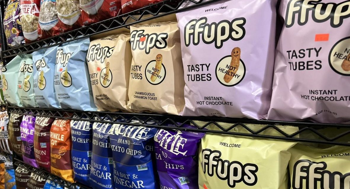
The anti-better-for-you branding
In a sea of better-for-you upstarts, one new company is taking the opposite direction in branding its snacks. Corn Puff brand FFups, which launched in March, is positioning itself as “transparently junk food,” founder and CEO Sam Tichnor told Modern Retail.
The brand is currently available at New York City specialty markets, as well as on Gopuff and Doordash, and is debuting on Amazon this month, with plans to launch at chains in the coming year. Tichnor said that in thinking about the concept with branding agency Day Job, he wanted to lean into the idea of embracing junk food. Ffups’ bags proudly proclaim on the front that its “tasty tubes” are “not healthy.”
“A lot of snack startup brands are focused on being better-for-you labels, but our surveys showed that 80% of people care more about a chip’s flavor,” Tichnor said. “We are transparently junk food, which is risky to include on the packaging.”
Ffups don’t have protein or other alternative ingredients, but Tichnor said the product’s label has about the same amount of calories and fat as most puff brands. He pointed to Cheetos as perhaps the most popular mass market corn puff brand. Other alternatives include Pirate’s Booty and the organic, plant-based version from Hippeas. Instead, the 1970s-inspired bags feature a puff emoji logo, with a spotlight on the SKUs – which include names like Professional Salt & Vinegar and Semi-Historic Sour Cream & Onion. “Our ideal tagline would be tasty puff, no health claims,” he said.